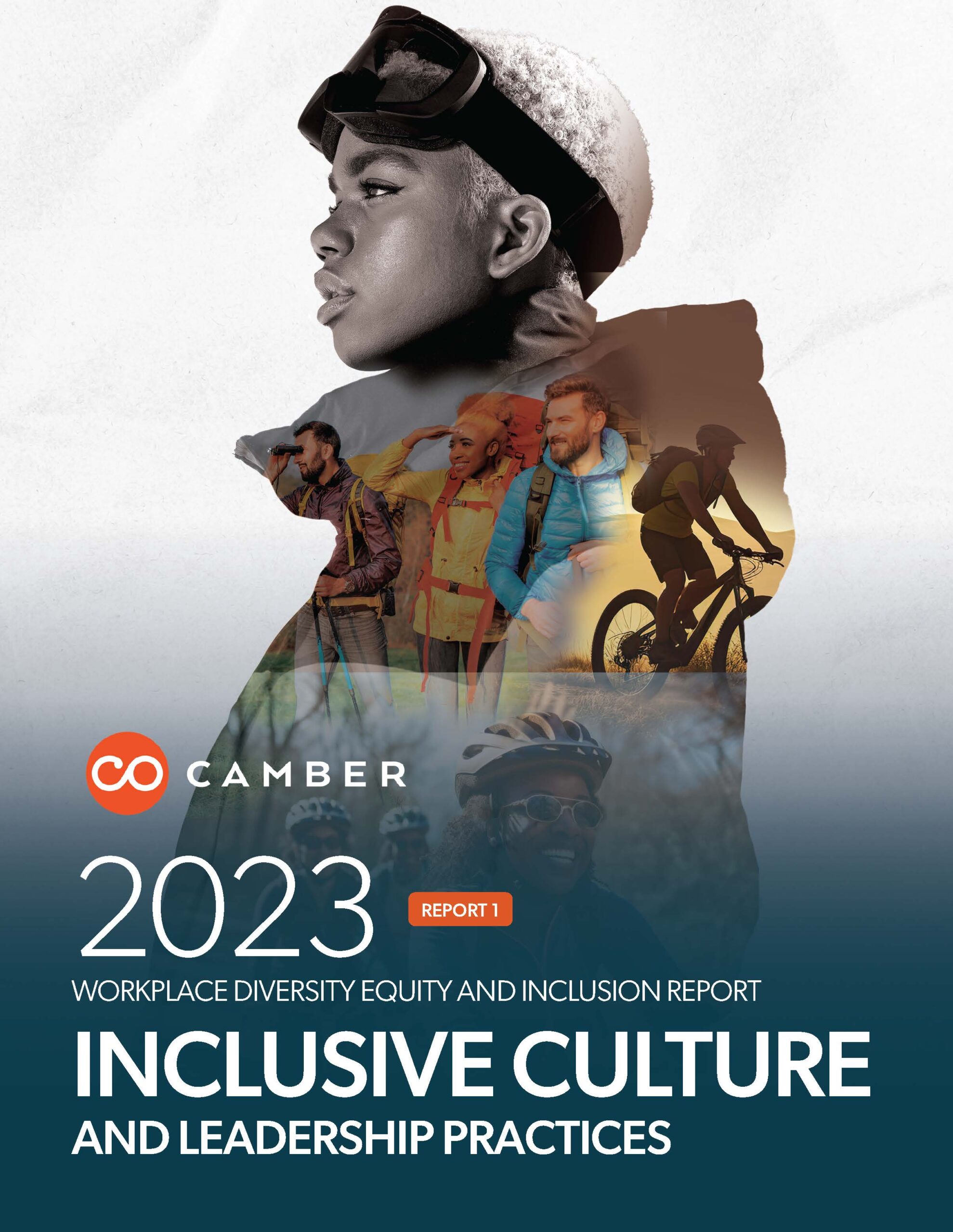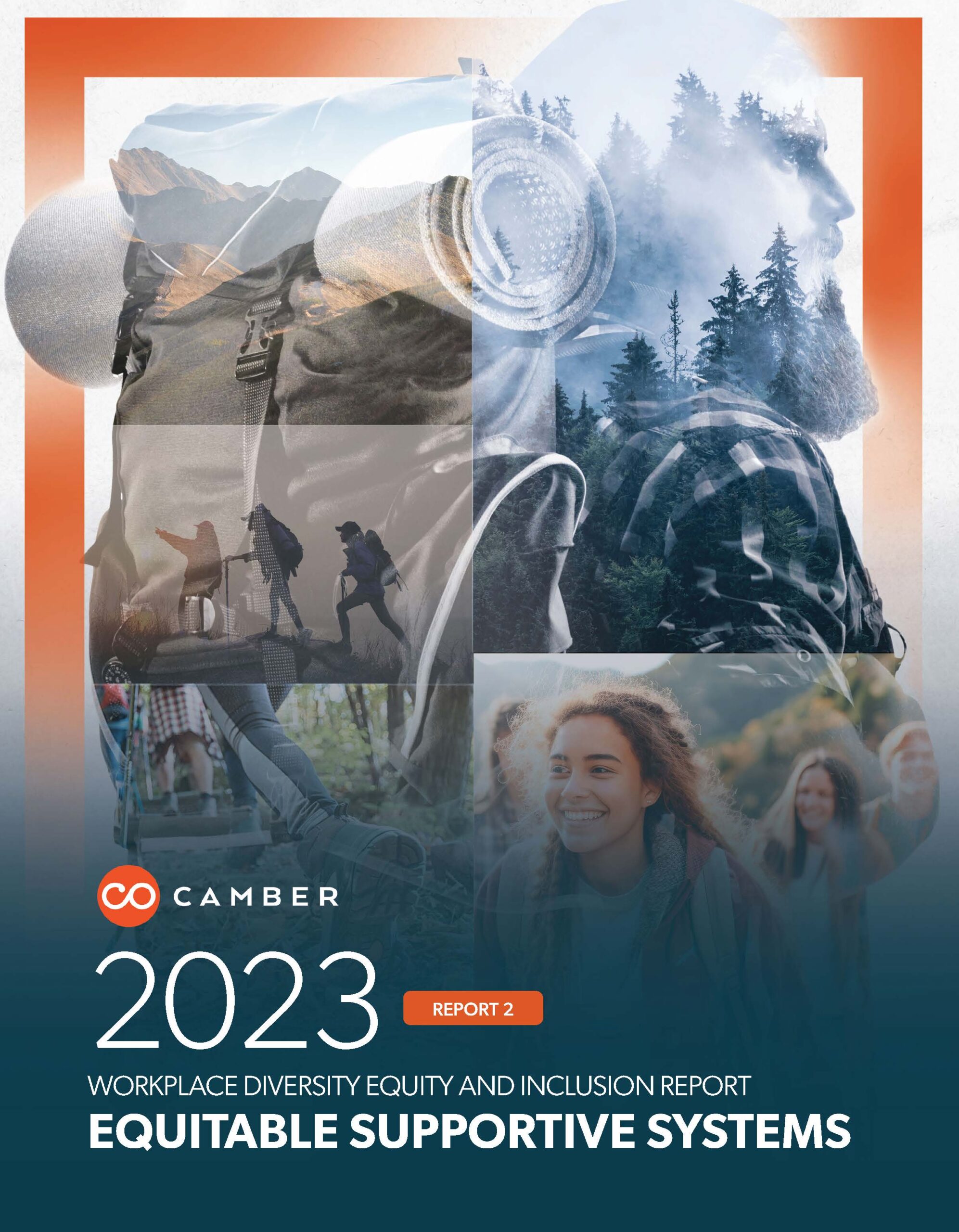
Editorial + Campaign System
Translating sensitive DEI research into something people actually read, trust, and act on.

Camber Outdoors had research. Good research. But DEI data is sensitive, dense, and easy to get wrong. They needed materials that felt credible and accessible—without flattening the nuance or losing trust with the communities they were trying to serve.
This wasn't a rebrand. It was a translation problem: how do you turn 50+ pages of equity data into something leaders will actually engage with?
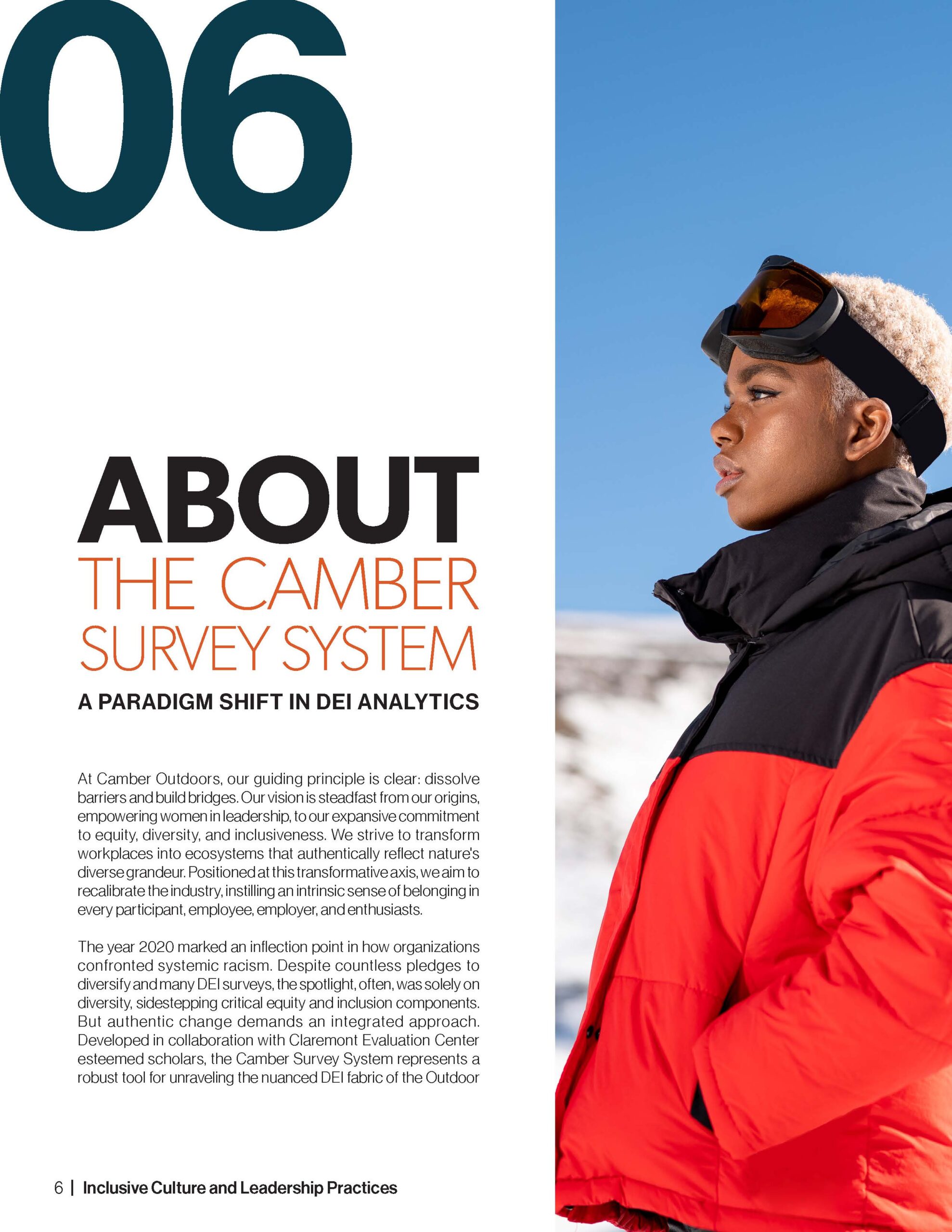
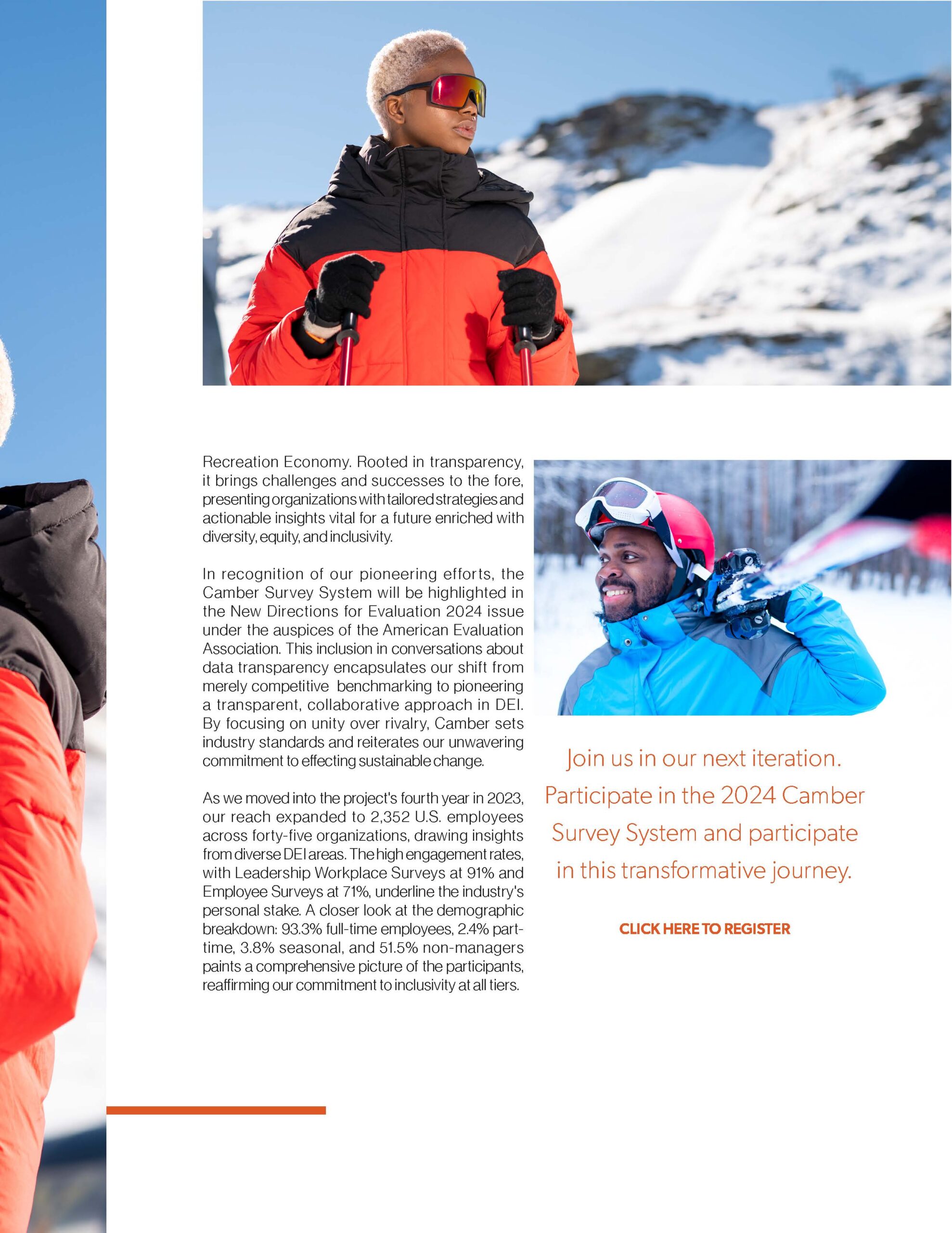
I approached this as an editorial system, not a one-off design project. Every piece—reports, social assets, event decks, certification materials—needed to pull from the same visual and narrative logic.
The goal wasn't to make DEI data "pretty." It was to make it legible—to let the numbers speak without overwhelming, and to let the stories behind them come through.
That meant information hierarchy that guided attention, not competed for it. Data visualization that prioritized comprehension over decoration. And a visual language that felt authoritative without being cold.


The work touched every stage of Camber's leadership programming:
The certification materials were modeled after education and professional recognition systems—because that's what this was. Leaders earning this weren't getting a badge. They were earning a credential.


The system gave Camber a way to present complex insights consistently—across formats, over time—while building trust with the audiences who needed it most.
More importantly, it gave their research legs. Reports that get read. Decks that get shared. A certification that means something.
Role
Creative direction · Editorial design · Data visualization · Campaign systems · Print + digital execution